

Landscapes, 2002–2004 Installation view, andata.ritorno laboratoire d’art contemporain, Geneva, Switzerland.
Landscapes, 2002–2004
Landscapes explores the landscape not simply as a subject to be represented, but as a field of perception. Mountains, forests, trees and distant horizons remain recognizable, yet they are progressively transformed through line, density, colour and surface.
Working with compressed charcoal on paper, alongside oil painting and other material explorations, the landscape is built through accumulation, pressure, repetition and erasure. The density of the charcoal allows black to become almost a material presence, while the untouched paper introduces light and space within the image.
Across works of different formats, the landscape becomes a structure: a meeting between dark and light, near and far, material and space. The repetition of certain forms—the mountain, the tree, the horizon—does not describe a particular place so much as question how a landscape remains within memory after it has been seen.
Presented together at andata.ritorno laboratoire d’art contemporain in Geneva, the works establish a rhythm across the exhibition space. Vertical, horizontal and grouped compositions allow the landscape to extend beyond the individual image and become part of the architecture itself.
Looking back, Landscapes, 2002–2004 can also be seen as an early stage of a continuing investigation: the gradual passage from landscape as
visible subject toward landscape as mental space.

jungfraujoch, 2002–2004, Oil painting on MDF, 15 x 100 x 2 cm
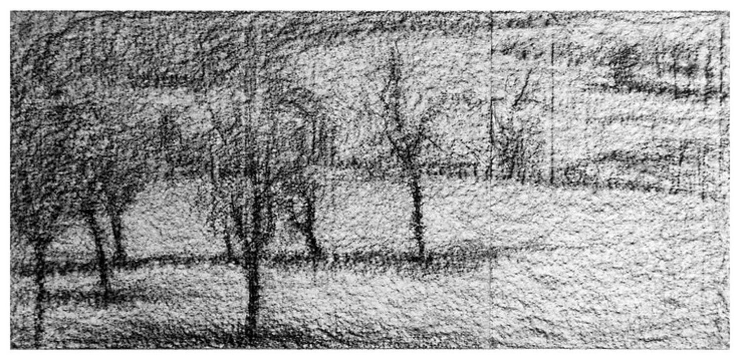
Landscapes, 2002–2004, compressed charcoal on paper, 65 x 150 cm
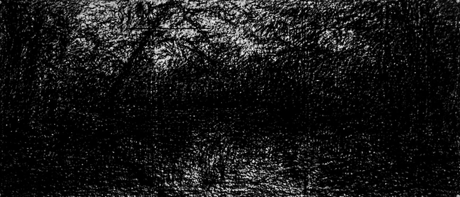
Landscapes, 2002–2004, compressed charcoal on paper, 65 x 150 cm
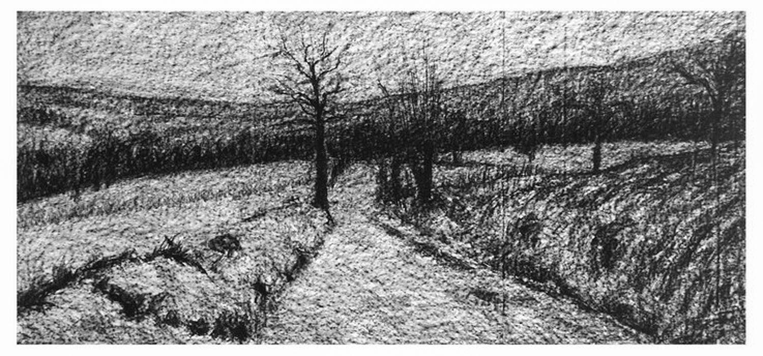
Landscapes, 2002–2004, compressed charcoal on paper, 65 x 150 cm
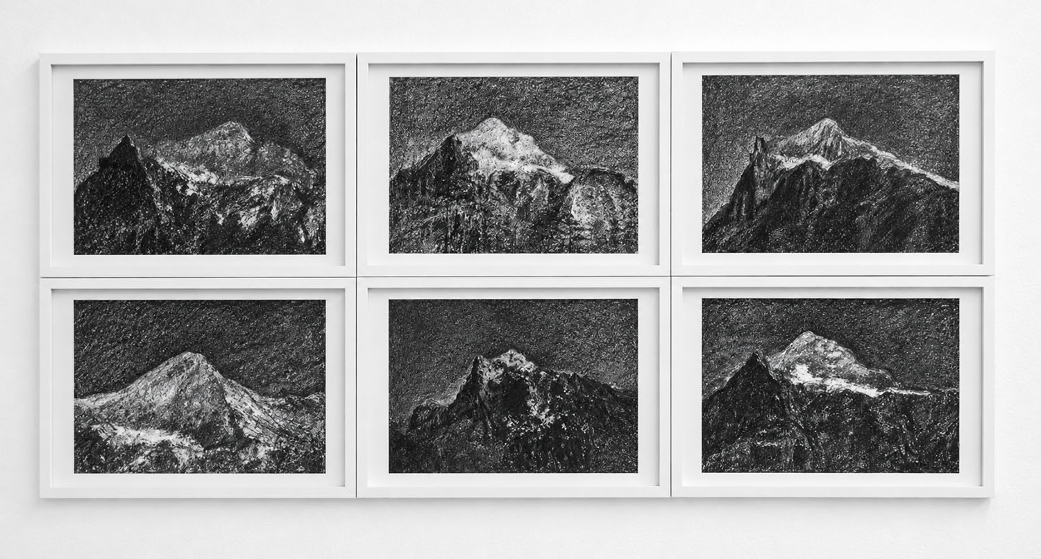
Mountains- Oberland Switzerland – Hexaptych, 2002–2004, compressed charcoal on paper, 6 x ( 50 x 65 ) cm
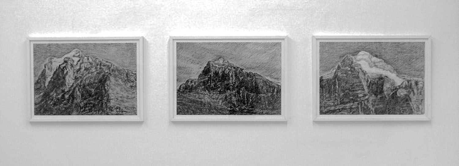
Mountains- Oberland Switzerland -Triptych, 2002–2004, compressed charcoal on paper, 3 x ( 50 x 65 ) cm
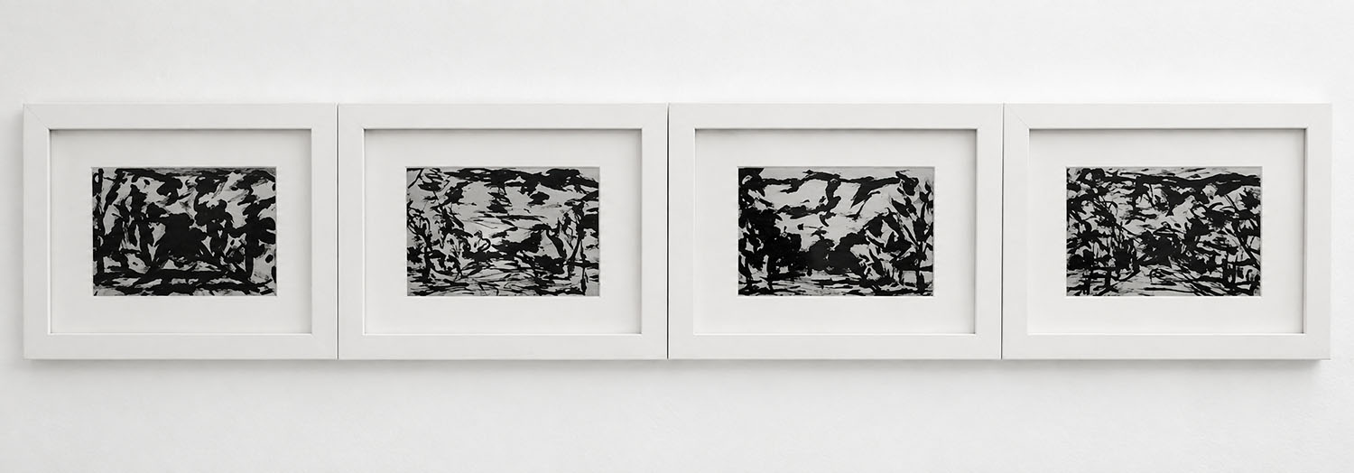
Landscape after Hodler – Quadriptych, 2002–2004, Oil on cardboard, 4 x ( 30 x 21 ) cm
Landscapes — Oil on Grey Cardboard, 2002–2004
This series continues the investigation of landscape found in the red-and-black paintings, but through a very different relationship between paint and surface.
Black oil paint is applied directly onto heavy grey cardboard. Unlike the smooth synthetic red surface, which tends to repel the oil paint, the cardboard absorbs the oil very quickly. As the brush moves across the surface, it gradually dries out: a continuous gesture becomes interrupted, and the expected length of the brushstroke is shortened.
The material therefore participates directly in the drawing. A line begins strongly, loses its density, breaks apart and sometimes disappears before the gesture itself has ended.
This produces the particular character visible in these works. The landscape is constructed from fragmented, abbreviated marks rather than continuous descriptive lines. Mountains, trees and vegetation appear through accumulations of black gestures and through the untouched grey of the cardboard between them.
What I particularly like in these four works is that, seen from a distance, they remain landscapes; but when one comes closer, representation begins to dissolve. The mountain or forest becomes a field of marks, interruptions, rhythms and empty spaces.
There is also an interesting relationship with traditional Asian ink painting here, although the material is oil rather than ink. The brushstroke does
not completely control the image. The surface, absorption, speed of the hand and diminishing quantity of paint all determine what remains
visible.
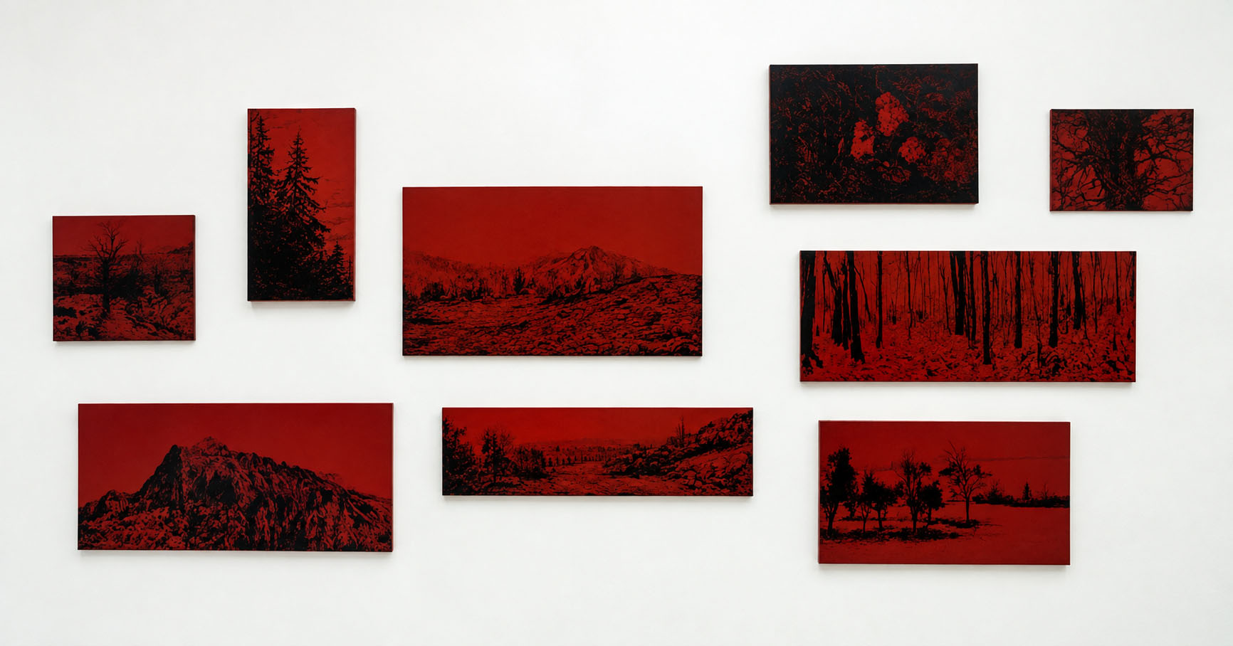
Landscapes — Red / Black, 2002–2004
In this series, landscape becomes a way of returning to questions of origin and identity. Mountains, forests, trees and distant horizons refer to the visual memory of Asian landscape painting, while the restricted palette of red and black evokes the appearance of traditional lacquerware.
The red ground, however, is not traditional lacquer. It is an industrial synthetic paint, chosen partly for the extraordinary intensity, smoothness and brilliance of its surface. Once applied, the synthetic red possesses an almost autonomous presence: luminous, artificial and strangely close in appearance to ancient lacquer.
Black oil paint is then applied over this highly polished surface. Because the synthetic ground tends to repel the oil paint, the image cannot simply be painted onto it. The black has to be worked gently across the surface—almost caressed—until it begins to adhere.
This resistance becomes part of the work. Rather than producing a uniform black, the process leaves tiny variations in density, texture and reflection. Across larger areas especially, the black seems to vibrate: it is never completely still or opaque. Light enters into the surface, making the image shift according to the position of the viewer.
The landscapes therefore emerge through a tension between red and black, surface and image, resistance and gesture. What initially refers to traditional Asian lacquer painting is transformed through contemporary industrial material and the physical behaviour of oil paint.
For me, this is also where the question of identity enters the work most strongly. The dialogue between Asian and European traditions is not
illustrated symbolically; it takes place within the painting itself—between an industrial surface recalling Asian lacquer and the European tradition
of oil painting.
Siripoj CHAMROENVIDHYA : Noir – Blanc / Espace
Il est des artistes plus contemporain qu’il n’y paraît de premier accès. Siripoj CHAMROENVIDHYA est de ceux-là. Présent dans la programmation d’ANDATA.RITORNO, aux côtés de Jean-François LUTHY, Jean-Marie BORGEAUD, Jean-Paul Bielmann Reoc, tous artistes travaillant dans le postulat d’une figuration toujours à réinventer.
« L’époque, la mode, la morale, la passion », de ces quatre composantes baudelairiennes de la modernité, l’actualité privilégie sans doute la seconde et peut-être n’est-ce pas le moyen le plus sûr pour accéder « infinitésimalement à des traces d’éternité dans le territoire de l’éphémère ».
La contemporanéité se mesure trop souvent aujourd’hui à l’unique duchampisme de l’objectalité, en oubliant que Marcel Duchamp est resté toute sa vie un grand amateur sinon admirateur de peinture et que sa distance « infra-mince » vis-à-vis du medium le plus classique, tenait également du plus grand intérêt et du plus grand respect.. Ses héritiers, souvent douteux, producteurs de ready-mades par centaine de milliers, oublient que ce geste n’avait de sens pour Duchamp que dans la rareté et une forme d’intelligence ascétique.
Plutôt que d’art contemporain, peut-être devrions-nous parler aujourd’hui « d’art vivant », pour reprendre le titre d’une revue qui a fait ses preuves en son temps. Siripoj CHAMROENVIDHYA est donc un artiste vivant, né à Bangkok en 1957 et habitant Genève depuis 1980. Ses techniques de prédilection sont le fusain sur papier et l’utilisation de laques industrielles de différentes couleurs appliquées sur des panneaux de bois. Le sujet basique de la nature (éléments végétaux, paysages) constitue l’essentiel de sa représentation, mais celle-ci glisse parfois vers des propositions à la limite ou purement abstraites. Disons que son champ d’action plastique est cependant principalement un rapport à l’espace et non pas, paradoxalement, comme on pourrait le croire de par le choix des technicités et l’utilisation de supports bidimensionnels, l’investigation de la surface plane. L’utilisation du noir et du blanc chez Siripoj CHAMROENVIDHYA est toujours dans une tension vibratoire à la recherche de profondeur spatiale. – A observer, à voir « de plus près » littéralement, ces fusains, (où par ailleurs, l’oblong dans le format est préférentiel) ; la figure du panorama est souvent présente et va de pair, c’est l’évidence, avec la notion de grand angulaire. Mais à quel degré exact fonctionne la mécanique oculaire humaine, nous ne le savons qu’approximativement, le champ de vision dans les fusains de Siripoj CHAMROENVIDHYA est constamment du côté de l’élargissement.
Des moyens sobres, le noir sur fond blanc exécuté avec l’humble outil d’un bois calciné, cela peut suffire pour prendre et représenter le monde à bras-le-corps et en enrichir le champ de ses visions.
Parfois, on assiste dans l’œuvre de l’artiste à l’utilisation de laques, référence directe à sa culture d’origine. Mais avec le seul fusain, les pistes sont déjà brouillées, des représentations de paysages d’alentour ont l’ambiguïté de vues beaucoup plus lointaines, de par leur facture. Siripoj CHAMROENVIDHYA, artiste et individu fait d’Orient et d’Occident, producteur de noir et de blanc pour mieux s’imprégner de l’espace entier, utilise la laque pour nous faire voir l’illusion de la réflexion- notre propre image piégée dans la figure picturale par la séduction de la brillance. Il semble nous dire, paraphrasant un grand cinéaste : « Ce n’est pas une peinture juste, c’est juste une peinture ».
Et maintenant, réfléchissez…les fusains !
Joseph FARINE
Le paysage selon Chamroenvidhya
EXPO. L’artiste d’origine thaïlandaise propose un panorama de dessins au fusain en noir et en nuances
Laurence Chauvy
Jeudi 18 novembre 2004
Rubrique: Culture
D’origine thaïlandaise, domicilié à Genève où il a suivi l’Ecole des beaux-arts, Siripoj Chamroenvidhya esquisse des paysages, et fait plus que les esquisser: au fusain, au crayon graphite, à la peinture, en noir et en nuances, il impose ses visions, constituées de montagnes, de fragments de nature, de coins de pays proches ou lointains qui, en dépit de la fidélité au réel, relèvent davantage d’une cartographie intérieure.
Le dessin à bras le corps
Le gros de l’exposition consiste en ces dessins grand format, qui misent sur la proximité, la frontalité, une manière presque d’immerger le spectateur dans le dessin. Ici, la campagne et même les cimes inaccessibles ne tendent nullement à disparaître dans un amenuisement croissant des teintes, un effacement des gris. Elles restent bien présentes, rassurantes d’une certaine manière. Rassurantes, les figures tutélaires de la terre et de ses «accessoires» que seraient les pierres, les rocs, les arbres, les fleurs et même les ponts et autres chemins.
Et rassurante aussi cette façon de prendre le dessin à bras le corps, sans chercher à biaiser avec lui pour faire neuf, pour faire contemporain.
La petite salle de la galerie abrite quelques peintures, sur un support rouge foncé, brillant, qui rappelle l’aspect satiné de la laque. Semblables silhouettes de montagnes, mais apposées d’une main plus économe; l’horizon échancré rappelle une ligne d’écriture, une calligraphie. Traiter ainsi le paysage n’est pas plus facile que brosser un visage, composer une page abstraite. Il y faut le sens de l’équilibre, la générosité dans le geste, l’acuité du regard. Et la volonté d’adresser ses œuvres à un public, qui puisse y arrêter son regard.